• 312 words
• By
I was recently asked to explore and dig deeper into a product marketing website that I personally think is well designed. For me, a few obvious choices came to mind, between Stripe.com and Basecamp.com I chose to dig in to Stripe.
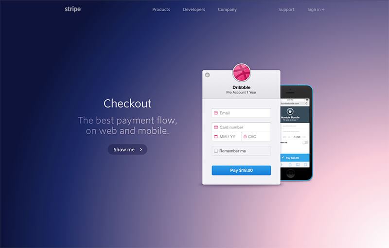
Here’s a brief exploration into Stripe’s marketing website - in particular, the “/checkout” landing page.
Stripe.com
Colorful, animated, clean, geometric, responsive (most pages*)
https://stripe.com/checkout > “Show me” design exploration.
In just 40 seconds, the design visually educates you, potentially even completely selling/converting you. And you trust them. Their pixel-perfect marketing site gives you an impression of them as a company, it says that their embeddable checkout modal will be just as perfected.
As a user, you start envisioning how simple, how clean, and how responsive your checkout process could truly be.
Stripe’s Checkout landing page journey:
After the first feature slides play out, your journey continues on down the page with deeper dives: further explanation and visualization, documentation, and resources for further research, if needed.
Alternatively, if you’re a website scroller, you can get all of the information you need from simply scrolling on through.
Their landing pages for the various products and features showcase the value propositions very cleanly, effectively, and concisely. Even though you can dive deeper into different parts of the website, you can experience the bulk of it and learn, very quickly (intentional - information architecture).
Users can come here to learn, to understand, and they’re going to walk away with a specific and lasting impression of Stripe, their products, and their authority in the industry.
*There are certain pages such as the /docs or /jobs that are on different, non-responsive templates, yet Stripe continually iterates and publishes new redesigns, focusing first on their high-level landing pages.
